Structure Colours – “modern” examples

Updated 01-03-2015: The subject of what colour to paint (or stain) our model buildings or structures is fraught with many difficulties, but to aid a current discussion thread on the Maine On2 Yahoo! group, I am publishing a few of my own colour photographs of what I would call “modern” examples of colour schemes.

Please note that these examples are not intended to be specific and accurate colour renditions of paint schemes used by the Maine Two Footers. My hope is that they may encourage blog readers and Yahoo! group members to share what paints they use for their models.

The original photographs were taken on film in the 1980’s and 1990’s during my then frequent travels to the USA. The same film (Kodachrome 200) was used in the same camera (auto exposure with override), and the pictures have all been scanned recently using the same scanner and software. Whilst the colours may be wrong, my assumption is that they will be consistently wrong.

tssco7

This shot shows the Edaville depot and restaurant in the familiar 1980’s Edaville colour scheme, which is believed to be similar to the old Boston and Maine colour scheme.

tssco6

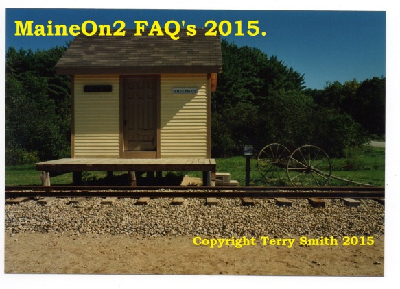
This picture was taken at the Wiscasset Museum sometime in the 1990’s, and shows the re-built and re-painted Sheepscot Station. I believe that the structure now sports a different colour scheme. It is open to debate and confirmation as to whether this was an attempt at the original W&Q colour scheme. Chris McChesney has commented;- I would say that the “Buff and Brown” scheme might have been based on the common conception in the 1970s and 80s, but this has not been confirmed from actual paint samples from remaining W&Q or WW&F structures.

tssco5

The next series of pictures were taken at the Boothbay Museum in one of the summers in the mid 1990’s when the various rail busses and rail cars visited. The Boothbay structures were painted in a two tone green scheme, somewhat reminiscent of the Grey (Gray) and Dark Green Maine Central “Pond Bottom” colour scheme applied to both the SR&RL and B&SR when these Two Footers were controlled by the MeC. The Wiscasset line also applied a similar two toned scheme using Light Green and Dark Green. Chris McChesney writes;-  The Dark Green on the WW&F was a little lighter than the Dark Green on the MEC/SR&RL/B&SR. The MEC Dark Green was actually pretty dark and there are several original structures in original Dark Green to prove this.


tssco4

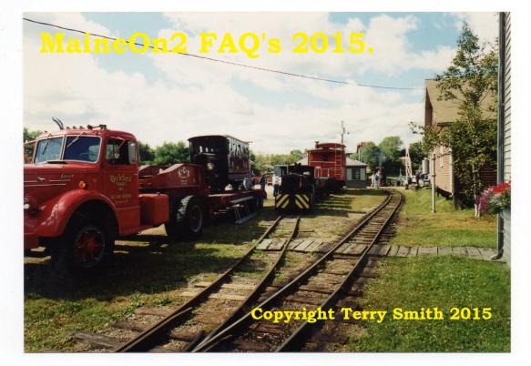
Shows the Boothbay structure colour scheme  in the shade – and an over-heating rail bus!

tssco3

Shows the Boothbay structure colour scheme in bright daylight (in the distance)

tssco2

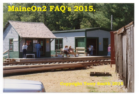
These two shots show the Sandy River Museum and their structure colour scheme, again on a summers’ day in the 1990’s. Presumably, this is another attempt at the Maine Central “Pond Bottom” colour scheme.

tssco1

The following two pictures were taken at the Conway Scenic Railway at North Conway, NH – a favourite journey break place for me in my travels, initially for the model shop that used to be in the block of shops to the right of the first picture and later to indulge in a treat of Ben and Jerry’s ice cream, ideally sat on their patio overlooking the yard – close to my idea of heaven – watching trains and eating Ben and Jerry’s outdoors in the sunshine!

tssco09


tssco10

This picture has been included because it shows three different appearances of colour schemes, note the differences between the crossing shanty, the freight shed in the distance behind it and the loco shed to the left. Sort of confirms the opening comment of how difficult it is to describe colours and colour schemes………more anon…….stay tuned!

Discussions are welcomed on any subject to do with this posting, apart from the spelling of colour.
 

Prototype buildings – flag stop station interiors

Flagstop Depot interiors

Does anyone know anything about the interiors of small flagstop depots (i.e: Chelsea on the KC, Alna Center on the WW&F, Sanders on the Sandy River)? I am curious whether they were finished or unfinished inside, if they had plaster or wooden interior walls, what paint colors were used, if they had furniture or benches of any sort, etc. Question posed on the former Maine Two Footers board. Poster not recorded.

Victor Hamberger replied: Narrow Gauge in the Sheepscot Valley, Gary Kohler’s book, has a couple of “first time published” pictures of Alna Center. Page 79 shows a clear shot of a very neat flagstop, with milk cans out front and an 8 over 8 window on the end and the door open. You can’t see the interior but there is a smoke stack on the roof for a pot bellied stove. The picture on the next page shows the building in near collapse in 1975, no roof now to hide the details. The back wall shows stud construction with 1″ horizontal sheathing under the clapboards. I would guess that the building inside for most/all of it’s life was bare studs with the sheathing under the clapboards, but nothing else finished in the interior. Just the stove and perhaps a bench to sit on to get out of the weather. Gary’s book also furnishes plans for this building, complete with a suggested framing layout. If it were finished, the usual treatment MIGHT be, wainscotting about 48″ high, capped with a rail of some kind, and horizontal boards above that, shiplapped perhaps to tighten the joints up, and a wood ceiling. Wood was cheap, easily worked, and provided some insulation from the weather. The wainscotting would provide the decorative touch needed to look prosperous. Stove and benches would likely complete the scene there as well, although the stove might be optional if there were no one to tend it. Vic H

WW&F stations, as far as Chris and I know, there are no interior photos of any WW&F station in operation, and no info has come to light regarding the interior color/colors. Gary Kohler M2FQ message on HOn30 group

Prototype colour schemes – Buildings, WW&FR


cmssco01

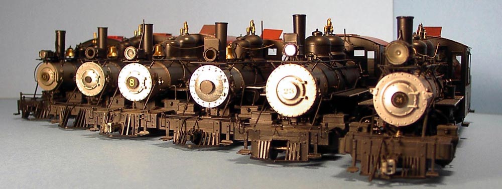
Completely re-written 01-03-2015 with information and the picture above provided by Chris McChesney, a noted Wiscasset modeller, and one of the authors of the Narrow gauge in the Sheepscot Valley series of books.

Chris writes: the picture above shows two models that have been painted correctly based on actual paint samples. The two Flag Stops seen on the left and right were built from Portland Locomotive Works wood kits.  The Upper Yard Section House in the middle was kit bashed to match Volume 1 Photos 116 and 117 (Sheepscot Valley) and the short piece of B&W movie of the same structure.  I chose to paint it in the original W&Q colours as there is no darker colour painted on the walls below the windows and it was built during W&Q time and there was no need to repaint it to WW&F colours as it is not a Station or Flag Stop.

W&Q 1893-1901 building colours: Mustard and Dark Red

Chris writes: in Volume 3 of Narrow Gauge in the Sheepscot Valley (pp. 108-109), Gary Kohler and I provided a great deal of information on the W&Q vs. WW&F colour schemes for stations based on a few colour photos and actual paint samples from several locations on the WW&F. We found that the W&Q scheme was actually a Mustard and Dark Red very similar to a sample from the F&M Ry. Men’s Section House in Bigelow.

We have since found actual colour samples of the W&Q “Mustard and Dark Red” in the original/upper part of the Albion station and below the green paint on shingles from the Head Tide Water Tank.  The “Dark Red” colour is more Red than Brown and is just like SR&RL Freight Car Red (which is very closely matched by Floquil’s AT&SF Red).

There is also a newspaper account of the Upper Yard Car Shop as being “Bright Yellow” (not the “Buff” that some have guessed).

WW&F 1901 onwards building colours: Light Green and Dark Green

Chris writes: the WW&F (1901 onwards) scheme was Light Green and Dark Green. The Dark Green does oxidize to a dark blue on the most extremely weathered edges, but for the most part it appears as Dark Green.

On WW&F (1902 onwards) structures I use straight Light Green (or Pale Green #4739 from Testors Model Master line) for the top colour and Dark Green (European 1 Dark Green #FS 43092 from Testors Model Master line) for the trim and bottom colour.  To accurately reproduce the oxidation noted above, any attempt at a weathered “Blue” should be restricted to dry brushing the very edges of the boards and shingles.

The following original text (some dating from 1999) is retained for reference:

What colors should I use to paint a depot for Wiscasset, Waterville and Farmington Railway in the 1920′s – 1933?

I see that Portland Locomotive Works has a light green and dark green on their Alna Center flag stop depot. Are those the correct colours? and if so what are they in Floquil, Polly-S etc. I can live with fairly close. Stephen Pinkham

The dark green/light bluish green is correct. I use Model Master Acryl 4739 Pale green with an extra drop of Polyscale 40452 MEC Green to darken it just a tad for the light green and PolyScale 505246 RAAF Foliage Green for the darker green. The RAAF green can also be used for the SR&RL green as it has the same FS number as the Model Masters enamel European Dark Green recommended for SR&RL and MEC buildings. For a brighter, freshly painted WW&F green and one that looks to me to be more like the bluish green that shows up in the few colour photos of WW&F structures around, I’ve used the PolyScale MEC Pine Green muddied a bit for scale effect with the PolyScale foliage green. -Jim P. HOn30

Prototype colour schemes – SR&RL Buildings after 1911

SR&RL building colors to use for painting after 1911

These pictures of the Sandy River Railroad Museum show their interpretation of the “pond bottom” grey and green paint scheme adopted by the original line.

Maine Central colors for buildings (after 1911)- Model Master Euro Dark Green and Aggressor Gray or PolyScale formulations with the same FS numbers are the closest thing based on samples the folks at M2FQ have found. The Maine Central guys recommend D&H gray. I like to add a tad of MEC Pine Green for a newer building or just a brighter look. -Jim red_gate_rover (MaineOn2 answer)

What is used by Bob Hayden in his C&DR’s official color scheme?

Bob’s scheme, in use for the past 26 years, is based on the gray and green used on the SR&RL (and MeC, when it owned the road). Most of the experts call it the “Maine Central pond-bottom scheme. Siding color for the buildings is Floquil Reefer Gray, lightened with about 20% Reefer White so the color isn’t quite so strong. This varies from building to building so they don’t look as though they were all painted on the same day. Sometimes I adulterate the gray with Floquil Earth to warm it up. The trim color is Floquil Depot Olive, modified with roughly 10% Earth. This also goes on the bottom of the siding, below the windows. Another answer From: “Bob Danielsen” (I did not record which group this was posted on when I copied it a long time ago)

The RAAF green can also be used for the SR&RL green as it has the same FS number as the Model Masters enamel European Dark Green recomended for SR&RL amd MEC buildings. -Jim P. HOn30